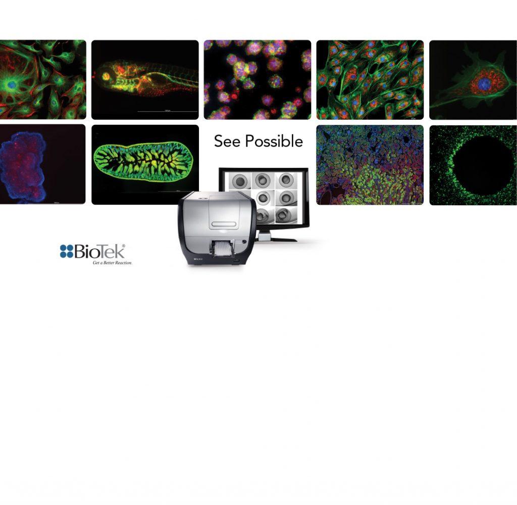
BIOTEK INSTRUMENTS CORPORATE IDENTITY
Client: BioTek Instruments, a global leader in the development, manufacture and distribution of life science instrumentation, including imaging & microscopy, multi-mode detection, liquid handling and automation systems.
Project: Refresh the BioTek brand by refocusing the company’s positioning, update the logo and tagline and apply the new brand standards across all marketing materials.
Goal: Revitalize the BioTek brand.
Objectives:
- Encourage the target to shift their thinking from BioTek as a low-cost provider to “there is a difference” and the right, reliable solution can enhance their assays yielding greater results.
- Elevate/communicate the importance of BioTek as a reliable technology partner.
- Position the company as the authority on microplate technology.
- Create the perception of a technology-driven partner providing reliable, cost-effective solutions.
Target market: Research scientists and employees.
My role: Articulate the brand identity, redesign the logo and design the various marketing communication materials (from ads and brochures to stationery and PowerPoint graphics), provide the graphical rules, including fonts, style, colors, etc.

BRAND
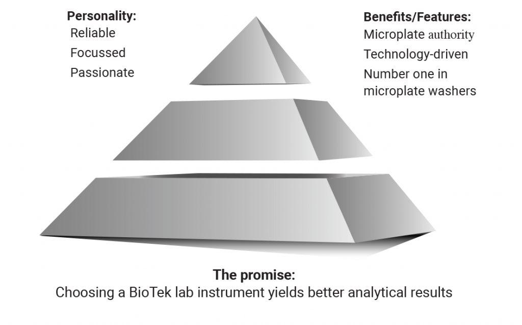
Key thought: BioTek’s sole focus is creating and maintaining reliable microplate instrumentation solutions that provide greater production efficiencies for research scientists.
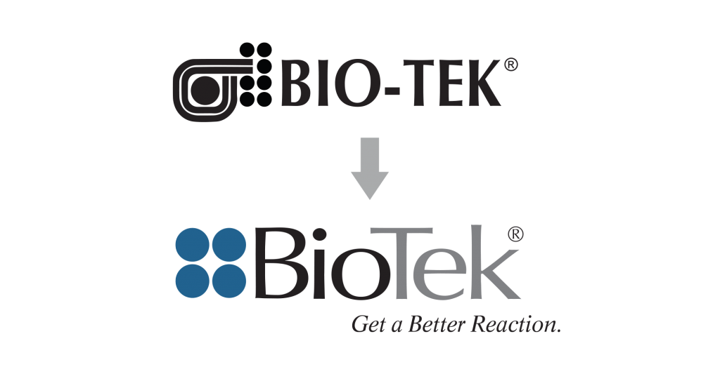
REDESIGN LOGO
Update the original logo and create a tagline consistent with BioTek’s positioning as a trusted manufacturer of high-quality microplate instrumentation. Client request: “Don’t stray too far from the original.”
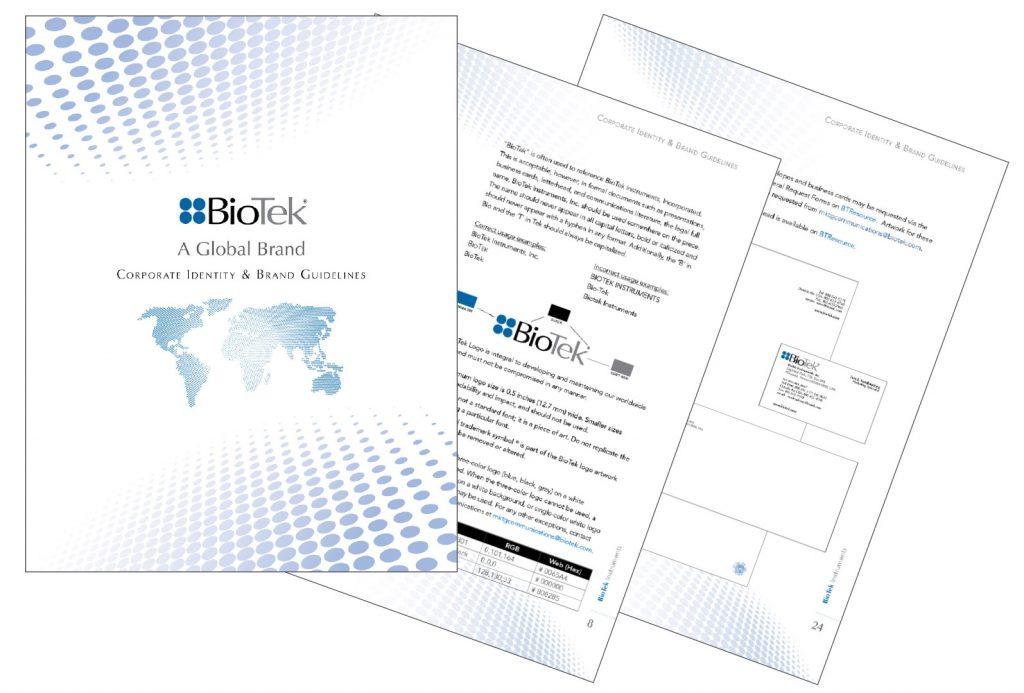
ESTABLISH GRAPHIC STANDARDS
Creation of a graphic standards manual.
MARKETING MATERIALS
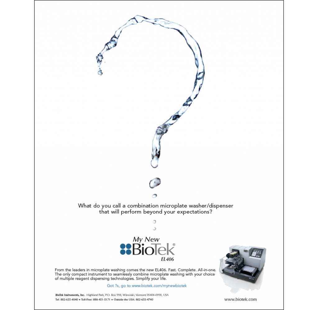
Advertising
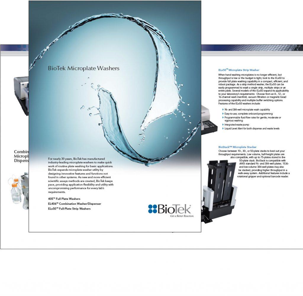
Collateral
Website design

Trade show graphics
